 Color choices influence mood, emotion and tone; a carefully chosen color scheme can clearly express a specific design style. There are certain colors that look good together, while other colors look so painful you have to click away before they burn your eyes.
Complementary Colors on Websites just makes a harmonious combination. On this post you’ll learn about them and a showcase of websites using the colors.
What are Complementary Colors?
 Dictionary Meaning
complementary color
–noun
1. Art.
a. one of a pair of primary or secondary colors opposed to the other member of the pair on a schematic chart or scale, as green opposed to red, orange opposed to blue, or violet opposed to yellow.
b. the relationship of these pairs of colors perceived as completing or enhancing each other.
Complementary colors are opposite on the color wheel. Red and green, yellow and violet, blue and orange, are the three simple pairs of complementary colors. These colors always go well with each other, hence the term complimentary.
How can complimentary colors helps in your design?
Complimentary colors just look great together and compliment each other. When people look at them, it makes them FEEL good. That’s how humans response psychologically. That’s also the reason why the color wheel is used by many logo designers, marketers, and advertisers.
Companies have been aware of complimentary colors for some time and most companies will spend a decent amount of money on getting it right. Good color choice really should be a priority for any marketing campaign, whether you are a big company like Microsoft or o2, or you are simply a local business just starting out. It can be difficult so here are a few tips on how to find the right colors for your brand.
Before choosing the colors to use you need to consider some things. For instance, a darker shade of purple and a lighter shade of yellow do not compliment one another nearly as well as a darker shade of purple and a darker shade of yellow do. Having a color wheel in hand would help.
Knowing this, when organizing your website, keep in mind that darker colors are easier to see than are lighter ones. Thus, if you choose a text color other than black, make certain it’s the darker shade of whatever complimentary color you’re using.
Additionally, be careful when using too many colors on your site. Choose two to begin with (complimentary colors, of course), and see what you can do using different shades.
Below are some best examples of sites using Complementary Colors.
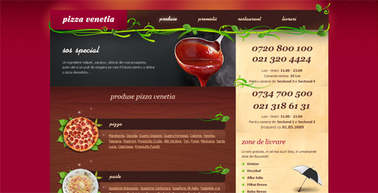
Red and Green
Orange and Blue
Yellow and Purple
Your Turn
Did you find this site inspirational or do you have some more sites using Complimentary Colors, send us a comment!
Get CISSP certified to become expert web designer. Learn about different color combination and their effects using 640-863 tutorials and 642-825 study guides.


