 We see a lot of reviews of different website but few blogs have written about the web hosting industry. Being the hosting geeks that we are, we thought that it would be fun comparing the look and feel of 20 Popular Web Hosting Company Homepages.
The results? Well, many of them need improvements and other just need to fire their entire design staff.
From the folks at WHS, check them out for hosting reviews or read articles.
1. HostMonster

HostMonster goes for a pretty basic web hosting look and feel for their website. It is not excellent but it is in now way bad either. An easy navigated website with no surprises.
2. JustHost

The first question that pops into my mind when entering the JustHost website is: what is the woman in the image listening for? It does not make any more sense when reading the text either. Other than that it is a pretty solid and easy understandable website.
3. FatCow

As with all web hosts offering “green hosting” there is a lot of the color green (duh) on the website. A very clean look and feel and instead of informing their visitors about the monthly fee FatCow lets you know how much you will have to pay for a year as a client of theirs. It’s a great cute theme with cows and definitely entices you to buy a plan.
4. InMotion
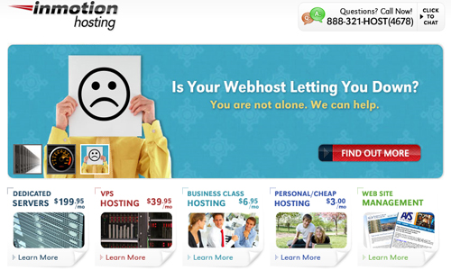
We like the InMotion website. It’s the only one to show someone with a SAD face;, that they actually understand consumers are not happy with web hosting companies. What is with all the girls smiling away on the home pages anyway?
On the index page you have five very clear options and once you have clicked any of these you will get more information. This website truly stands out in a good way in the web hosting industry.
5. GoDaddy
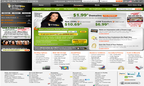
The GoDaddy website has one of the spammiest pages ever. Can you understand what is going on and what they sell? You encounter a lot of text, images and alternatives all at once; a sensory overload. If GoDaddy didn’t invest millions in television ads and supermodel girls, they would be a nothing website.
6. HostGator
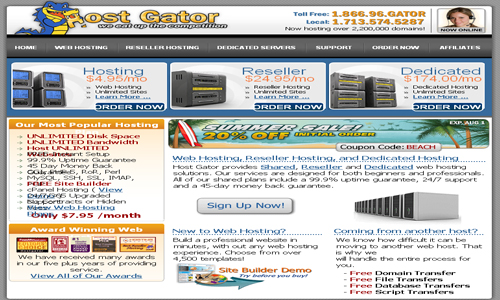
Maybe it is about time that HostGator update the look of their website as it is still web 1.0. Better than some hosting company sites that are 1995 styled. There are too many font sizes, colors, bold/italicized to understand where the focus should be.
7. LunarPages

Perhaps not the best of web designs but still user-friendly that have trustworthy impression. Make it a bit brighter, and tone down some of the plan options and it could become a very pretty website.
8. BlueHost
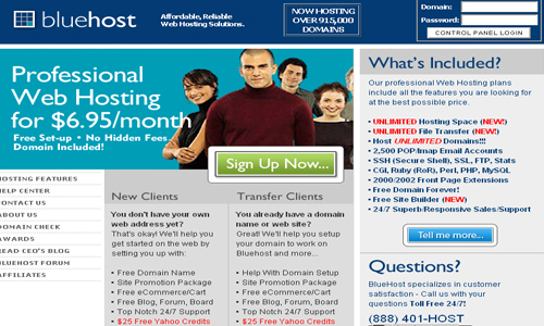
The BlueHost website is unfortunately a boring one. Sure, web hosting is not one the sexiest topics but we still deserve something better than this. Honestly, I hate seeing stock image people on hosting home pages. I know YOU don’t work for them, so why do I care? And the logo is unsexy to say the least.
9. Arvixe
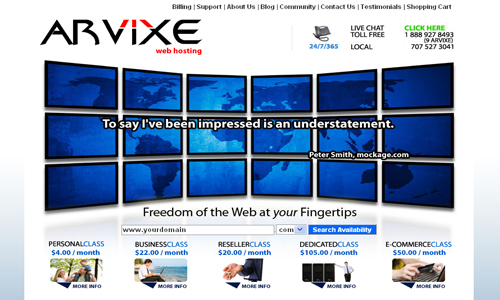
Now this we like! It is the same concept as the InMotion website and Arvixe pulls it off with no problems whatsoever. Easy menus and great combinations of colors.
10. GreenGeeks
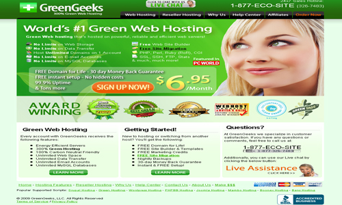
See! Another smiling girl. The logo, the plus sign, makes us think about a hospital; which we are doubt is a good thing. Other than that this is your usual hosting website with anything you might expect.
11. WebHostingBuzz
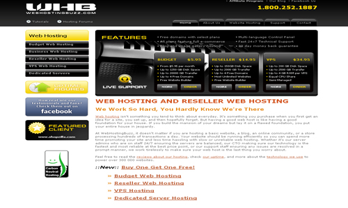
The black colors and the way it presents itself make it look like a very techy hosting service. Since it is directed to people looking for budget, reseller and VPS hosting we think that brighter colors might be better. However, it is a very easy navigated website which is the most important.
12. DedicatedNOW

DedicatedNOW offer more advanced hosting and you also get that feeling when visiting their website. For their purpose we think it works well. Except for part of the site falling off the viewing space, whoops!
13. Yahoo! Web Hosting

Although we like a lean design, Yahoo! Web Hosting does not really do it for us. The info is pretty well hidden and it is just not that appealing. So close but still so far away.
14. 1&1
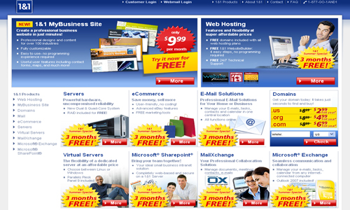
No, no, no! We do not want to feel as we are at the supermarket when visiting our web host. 1&1, please remove all of the yellow “promotion bubbles”.
15. Super Green Hosting

Super Green Hosting does not only offer conscience clean hosting they also present it via a beautiful website. Everything is easy to find and they use colors that go well with their hosting. It is definitely one of the more web 2.0 sites.
16. StartLogic
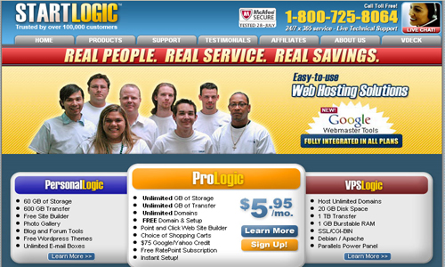
StartLogic really needs to do something about team photo. At first you think that you have entered a medical site since the people on the image all look like doctors in their matching white t-shirts. Then you see the random Google Webmaster tools sticker. Really? Is THAT your product? Who cares. The color scheme also needs to be toned down and modernized.
17. HostPapa

This is an ok hosting website, from a design perspective, but not much more than so. The HostPapa site is pretty standard and you do not really get a wow factor when visiting the – however not many hosting sites do.
18. Globat

Yet another standard hosting website. It is pretty easy to find what you are looking for and yes, it makes you feel as if you are visiting a trustworthy website.
19. WebHostingPad

And another girl smiling at us…are you bored yet? We are not too sure about the colors they have chosen to go with but yes, it is a functional hosting website. However, do remove/replace the “Click For Live Chat” button as its shape, diverse typeface and constant blinking makes it look like something belonging in the red light district.
20. Omnis

The last of our smiling girls. The Omnis Network website is a very traditional hosting site but we like it more than others. The reasons for this are its user-friendliness, spare use of different colors and authoritative look and feel.
Enjoy the freedom in managing your own data infrastructure and web hosting using colocation hosting services.
Your Turn
Got a website hosting company site you love or hate? Let us know with a comment!
Host your beautiful website on the best web hosting from WebHostingBreak.
We see a lot of reviews of different website but few blogs have written about the web hosting industry. Being the hosting geeks that we are, we thought that it would be fun comparing the look and feel of 20 Popular Web Hosting Company Homepages.
 The Featured Wallpaper of the Week is a weekly feature of great wallpapers done by awesome designers.
In this week, we will feature “Stabilis” by Jason Benjamin. Get to know the concept about the wallpaper and some information about the designers.
It’s time change your wallpaper now!
Stabilis


About the Wallpaper:
When I started this wallpaper I didn’t even have a general idea of what I wanted it to look like. I just started off drawing with the pen tool in Photoshop, and worked from there. I was originally going to make it one solid color (probably blue or green) but after making so many monocromatic wallpapers, I wanted to make something different. I chose the name “Stabilis” when randomly skimming through a latin word list. It translates to “firm or stable.” I’m horrible at naming things, so I just picked something that sounded nice and didn’t have too many hits on google.
Sizes are:
Widescreen: 1920×1200 | Fullscreen: 1920×1440 | Fullscreen (5:4): 1280×1024 |
The Designer:
Name: Jason Benjamin
Website: http://minimanjapan.com (personal) perfecthue.com (business)
Short bio I’m currently a senior in high school and my main interests are in web design and photography. I don’t make wallpapers very often, but I’m always open for any ideas/suggestions. My contact info can be found on my website.
Your Turn
Did this Wallpaper Pack rocked your desktop? Show some appreciation!
Be Featured!
Want your wallpaper featured? Let us know and contact us!
The Featured Wallpaper of the Week is a weekly feature of great wallpapers done by awesome designers.Widescreen: 1920×1200 | Fullscreen: 1920×1440 | Fullscreen (5:4): 1280×1024 |
Website: http://minimanjapan.com (personal) perfecthue.com (business)
Short bio I’m currently a senior in high school and my main interests are in web design and photography. I don’t make wallpapers very often, but I’m always open for any ideas/suggestions. My contact info can be found on my website.
 The Featured Website Design of the Week is a weekly feature of great Websites with great design done by awesome designers. Here are some nationality influenced pattern inspiration for your website design.
In this week, we will feature the websites, Made In Space, Foehn, Weberica and Lebloe. Get to know about the website and some information about the designers.
Made In Space: Web & Flash development
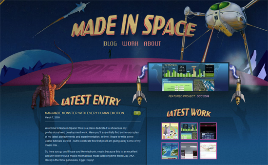
Madeinspace is the portfolio of Freelancer Fabrice Million, Flash and Web Developer based in Melbourne.
Designer: Hayden Peters
Bio: I Design, scaffolds & builds websites & Flash applications, My specialties evolve around Interaction Design, programming Flash with AS3 and building Flash Apps, Websites or widget that you can tweak and play with! I also specialise in accessibility and standards compliant XHTML/CSS/Javascript development.
URL: http://madeinspace.com.au
Foehn – Business Technology Solutions
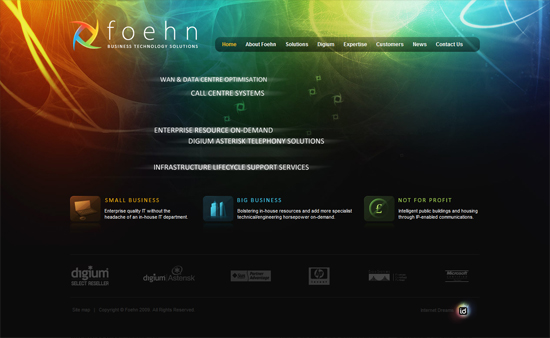
The company is a professional services company aiming to deliver next generation solutions (IP/ open source/ software solutions). Innovation, technology, professionalism and flexibility was what we wanted to convey.
Also Foehn refers to a dry hot wind in Europe something that was in the mind of the designers at the time.
Designers: Internet Dreams
URL: http://foehn.co.uk
Weberica
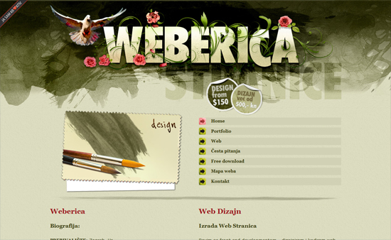
This is my personal portfolio, I designed, sliced and code it.
Designer: Branka
Bio: I am freelance web designer from zagreb, croatia, also write articles for design blog www.kroativ.net.
URL: http://weberica.net
Lebloe
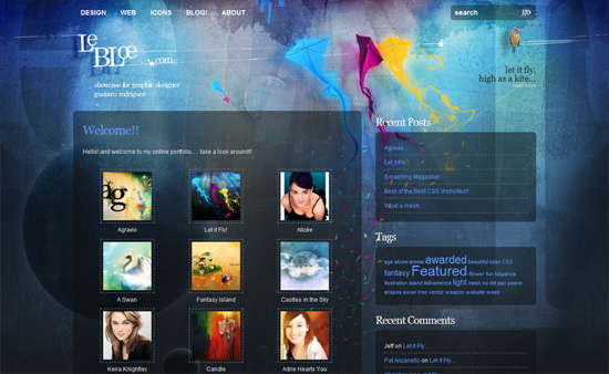
A personal portfolio of Gustavo Rodrìguez. From the designer: The name, I know, it’s a little odd, it’s a “french course mispelling” (about 9 years ago, when trying to spell, le bleu), and despite it’s weird, and somehow meaningless, it was pretty original, after that I realized I was using it everywhere, and then, it had to end up being my graphic identity.
What takes most of the attention is the background, I just came out with an idea of a kite, in a more “fantastic” way, once I started I just let it flow, overall, since it was about my own website, I was doing it my way. As a designer you have to always think about convincing your customers, and showing them something they like, this time I was trying to convince myself and that was the result. After that, the concept of “let it fly, high as a kite” just came easily to my mind and well, there it is.
Designer: Gustavo Rodrìguez
Bio: A graphic designer from Colombia, and have been living in Montréal (Canada) about 8 months so far. He worked on different web development projects, multimedia and icon illustration, although what he enjoy the most is illustration and photo manipulation, he likes to experiment with colors, shapes, and the themes are pretty much based in fantasy and surreal topics, he like to add a grungy style to his designs, work with colors and contrast.
URL: http://lebloe.com
Your Turn
What do you think of this websites? Which one’s your favorite?
The Featured Website Design of the Week is a weekly feature of great Websites with great design done by awesome designers. Here are some nationality influenced pattern inspiration for your website design.Designer: Hayden Peters
Bio: I Design, scaffolds & builds websites & Flash applications, My specialties evolve around Interaction Design, programming Flash with AS3 and building Flash Apps, Websites or widget that you can tweak and play with! I also specialise in accessibility and standards compliant XHTML/CSS/Javascript development.
URL: http://madeinspace.com.au
Also Foehn refers to a dry hot wind in Europe something that was in the mind of the designers at the time.
URL: http://foehn.co.uk
Bio: I am freelance web designer from zagreb, croatia, also write articles for design blog www.kroativ.net.
URL: http://weberica.net
Bio: A graphic designer from Colombia, and have been living in Montréal (Canada) about 8 months so far. He worked on different web development projects, multimedia and icon illustration, although what he enjoy the most is illustration and photo manipulation, he likes to experiment with colors, shapes, and the themes are pretty much based in fantasy and surreal topics, he like to add a grungy style to his designs, work with colors and contrast.
URL: http://lebloe.com
 The Featured Website Design of the Week is a weekly feature of great Websites with great design done by awesome designers.
In this week, we will feature the websites, Fearless Flyer, Christine Galvin Design, Razorbraille and Danny Diablo. Get to know about the website and some information about the designers.
Razorbraille
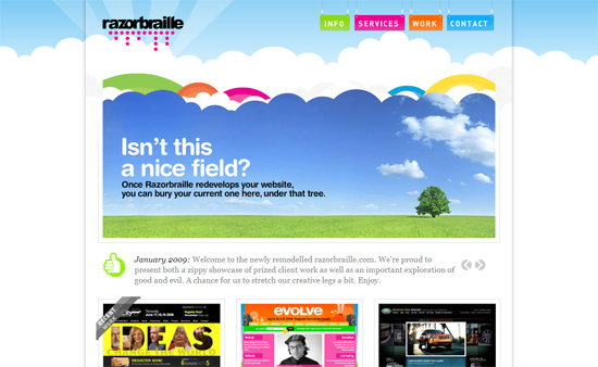
Razorbraille is a very good digital design and interactive production studio based in Toronto, Canada. We mostly design, build, and manage extraordinary and award-winning websites for some very important clients, but we also design top-shelf logos and corporate identities, signage, books, posters, and merchandise–that sort of thing. You should call us right now.
Designer: Site concept and design by Razorbraille.
URL: http://razorbraille.com/
Christine Galvin Design, Inc.
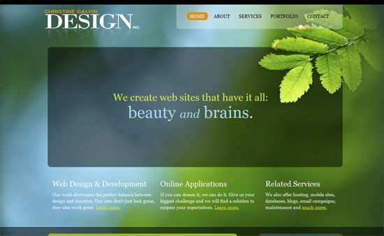
Christine Galvin Design, Inc. is a custom web design and application development company.
Designer: Christine Galvin
Bio: Christine has a degree in Graphic Design as well as over 10 years designing and developing web site for corporate clients. Her passion is creating user experiences that are gorgeous as well as highly intuitive. She’s currently integrating this philosophy into custom web applications.
URL: http://cgalvin.com
Fearless Flyer
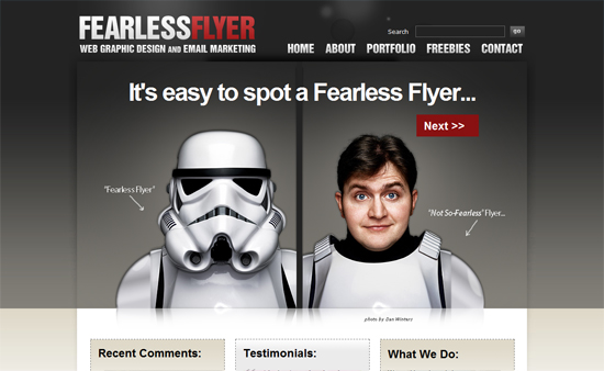
Fearless Flyer is a web design firm specializing in WordPress blogs. Our services include entire theme design life cylce – from photoshop mockups to XHTML and CSS coding. We develop the latest styles and trends in web design including portfolios, magazine style and custom layouts.
Designer: Michael Soriano
URL: http://fearlessflyer.com/
Danny Diablo – Portfolio of Daniel Knaack
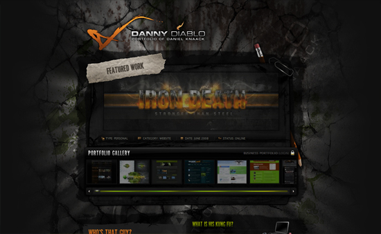
DannyDiablo is a personal portfolio of Daniel Knaack, graphic and web designer from hamburg, germany.
Designer: Daniel Knaack
Bio: I am the designer and I am working as media designer.
URL: http://dannydiablo.de
Your Turn
What do you think of this websites? Which one’s your favorite?
The Featured Website Design of the Week is a weekly feature of great Websites with great design done by awesome designers.URL: http://razorbraille.com/
Bio: Christine has a degree in Graphic Design as well as over 10 years designing and developing web site for corporate clients. Her passion is creating user experiences that are gorgeous as well as highly intuitive. She’s currently integrating this philosophy into custom web applications.
URL: http://cgalvin.com
URL: http://fearlessflyer.com/
Bio: I am the designer and I am working as media designer.
URL: http://dannydiablo.de